Monday, 7 March 2016
Wednesday, 10 February 2016


Sunday, 7 February 2016
Evaluation 3
3) What have you learn from your audience feedback?
Feedback from the audience is part of evaluating the work. The purpose of this is so that you can gain an understanding of what the audience think about a product. You can learn their opinions and what they think about your work. From this you can go on to make changes. If you get negative or constructive feedback you can go and change the product to make it appeal to the audience. The changes can make it overall more intriguing, effective and relatable. The feedback means that you have a chance to iron out any mistakes or add anything which could boost the products success and effectivity.
When my group and I did the feedback we used Youtube. Youtube meant that we could upload the music video and the audience could leave comments, like or dislike the video and share it on other social media websites. We chose Youtube because it meant anyone could leave there opinion and the video was available to a wide audience. It also related to our target audience because most 25-40 years olds have access to this technology and use it themselves of a regular basis.
One constructive comment the video received was to add the text on Final Cut Pro X. My group and I forgot to add the title of the song and the artists name to the video, so this comment was extremely helpful. it told us that we needed to inform out audience the key information about the video which meant could spread it to friends and family.
Another constructive comment left on the video was to use a wider range of shot. This viewer thought that the shots in the music video was not a big enough variety. This comment mean my group and I could add to to the video and make it more interesting for the audience. The group and I took this on board and realise that the product would be better if there were different style shots. To do this we had to go out and do some more filming and then edit the new footage into the video. We had to plan out the different shots which they audience would like to see and recreate them to fit in with the video.
My group and I also got some positive comments. one was that we used good costumes. This audience member seems to like our choice of costume and also said that it fits the narrative well. This was positive because we were praised for the two element and told that we created the look we as going for. From this we knew that our plan had paid off and created what we wanted too.
Another positive comment was that the performance was good. The audience enjoyed how the artist performed he song how she presented it to the audience. This showed the group and I that this scene was effect and it was fun for the audience to watch. This is hat we was hoping for, we aimed to make this scene enjoyable for the audience by showing them the artist performing and allowing them to relate to her representation.
These comments helped my me as a producer because they made me aware of my mistakes, meaning I could learn from them and change them next time around. The positive comments made me feel confident that some parts were successful and effective for the audience. I now know how I can use them in other products.
Changes were made as a result of the comments. For example the text was added showing the audience the title of the song and the artists name. This was essential to add because without the audience would be unaware of what they were watching and therefore could spread the word about it, jepordising its success. The group and I added a this in a simple font in white. We also added more shots to the date scene, including a few ver the should shots of ‘Cara’ talking to her boyfriends and also extreme long show of the walking around the pond. ThIs meant the audience stayed intrigued in the scene and it didn't get boring.
The audience feedback has helped when working in the music industry because you can learn from your mistakes and become more successful, you also do not get overly effected by negative comments instead it is taken as construction. It also makes you able to relate to your target audience because you can see what they like and dislike, you become more focused on what they want meaning you r products will be more successful and effective.
Friday, 5 February 2016
Evaluation 1
In what ways does my music video use, develop or challenge conventions?
For my coursework in A2 media I was asked to create my music video and ancillary texts. The class was put into a group where we planned, researched, constructed and evaluated our work. Overall we made a music video together and an individual digipak and magazine advert.
The purpose of a music video to make a song or artost appeal more to the target audience. the audience can see the artists representation and how they portray their music. An artist is able to express there emotions about the song and show their audience how it's effective. Therefore the audience can relate to how the artist feels and the song, the purpose is to intrigue the audience, making more views. It also gives them something to remember it by, they can relate to the song and therefore mention mentiuons it to friends and family, making them g on to listen and watch. For my music video the group and I decided on Amy Winehouse as our chosen artist and we chose her song In My Bed.

 Another convention of a soul music video is costume, specifically women in sophisticated dresses. I most soul videos including an adult woman consists of them wearing different outfits one of which normally has a classy look. This is because the sophisticated dress makes the artist look smart and professional. Soul artists are known for being serious about their work and it meaning alot to them. This is because they use their own emotions to create their music, therefore meaning they are very serious about their work. The sophisticated look relates to the genre because it shows the audience how the music is produced through the true emotions of the artist, a common thing seen in soul.
  One last convention of soul is mise en scene, specifically facial expressions. A lot of the time if the artist is in the music video they use many different faicial expressions to appeal to their audience and build a relationship with them. It is conventional to soul because soul artists are known for expressing the emotions a lot. Unlike other genre artist who are more focused of impressing their audience not relating to them.
Overall my ideas were create a conventional soul music video with some modern improvements. The idea was to make the video appealing to the target audience and make it creative. I got my inspirations from other music videos. The inspiration I am following the most is Amy Winehouse's video for back to black, I like it because it has performance and narrative styles which I think are very effective. I wanted to use these styles in my own music vodeo because i think the allow the audience to connect the most.
 In my music video my group and I followed many soul conventions to make the product more effective and appeal to the target audience of 25-40. One of the conventions used is the narrative style. In the music video there are lot of connections with a love story. One specific scene is a date between the artist and her boyfriend, they sit at a table and have dinner, hold hands, cuddle and then they have an arguement. This is shown as a flashback, informing the audience of the break up and defineing the past to the present. This love story is often used with soul music because the songs are commonly about a break up or relationship issues. It is convnetional to see a love/heart break narrative as it shows the audience what the song is about and what the artist has or is going through. They expect to see some kind of relationship story and therefore the video is made more effective. This is why my group and I used a date scene because the audience are given a better chance of relating and building on relationship with the artist.
 Another convention used in my music video is cinematography, specifically close ups. There are many close ups of the artist in the video especially in the bedroom and performance scenes. The close ups allow the audience to see the blank/sad facial expressions of the artist and can therfore gain an understanding of her emotions. In most of the close ups used in my music video, the artist loks very serious and sad. When the audience see this they not only relate to her but relate it back to the soul genre. This is because these upset emotions are commonly portrayed by soul artist and are most effective for the song. My group and I decided to follow this convention in order to allow our target audience to inderstand the soul music and build a relationship with our artist and her music.
My music video definatly uses conventions to make it more effective. All the conventions within it attract the audience by allowing them to build a relationship with the artist and the song, they are able to look deeper into themeanings of the song and the emotions of the artist. Conventions are used well to make the video more interesting and exciting whilst also creating the correct emotions for the audience to understand the music. The video also develops conventions to make them more modern. For example the convention of women being in classy outfits. The artist is seen in a knee length, high neck black dress. The look was made more modern by the heavy make up and high heels, this adds to the convnetion and develops it. My reason for this was to make sure all ages with in the target audiene could idolises the image, from the younger to the older. I dont believe that my music video challeneged any conventions, everything was suitabe and effective.
An artist whom I found inspirational was Adele. I analysed her music video for 'One and only'. An idea I took from this video was the editing technique of fading. Ths was used a lot in the video to go from one scene to another, it made the video slow and calm. I liked this look because it emphasised the artists emotions of beign fed up and worried. The audience can see her emotions and how se feels when singing the song and expressing her emotions. I want to use this fade technique to give my audience the same calm emotions and allow them to understand how the artist feels.
Sunday, 10 January 2016
Rough Cut - Miss Gergiou
Rough Cut
Audience feedback is important to a production because it allows the producers too see what is most effective to the specfic target audience. If it is known what the audience think about a product it can them be improved to appeal even more. They can point out the negatives which can then be changed and the positives which can give ideas for the weaker parts of the product. It is essential to follow out a rough cut so that this audiene feedback is given. The audience can see the basic of the product and then say what needs to be added or changed. Their opinions make sure that the producer has enough ideas for the final cut to be as effective as possible.
I recieved my audiene feedback through youtube and a questionnaire. First was the questionnaire from my primary research, I made list of questions relivant to the product I wanted to create and then asked 40 people. With the results i could see what the audience were in demand of and what they enjoyed to see the most. I then chose the most effecitve elements they chose and planned to use them in my music video. The other piece of audience feedback was youtube, I posted my rough cut on youtube and made it public. This meant that people could comment on it, like or dislike it and share it onto other social media sites. The comments and like buttons ment that the audience could leave their opinion after watching the rough cut.
The feedback benefits my productions because it allows my group and I to understand what the audience think about the product. We are able to see there side of it and what they want to be included within the music video. Therefore we could use elements that we knew they wanted and what was most effective to them, meaning our product would attract them more. It is benefitial because the more specific the product is to the target audience means the more successful it will be.
One of the comments positive left on the rough cut on youtube was "costumes fits the narrative really well!!!'. This person mentions that they like how the costumes fit the narrative. We planned out the artist image for each of the scenes and thought alot in to the costumes and what they could include to make the narrative stand out more. Clearly they seem to think that our planning was effective. This was helpful because it meant the group and I didnt have to change the costumes of the characters and that the plan worked well.
Another positive comment said "Very good performance". The comment mentions that the performance scene in the music video was effective, they praise the performance of out artist. This is a good comment as my group and I know that we wont need to make changes to that scene, we can see that it is enjoyable.
 One last positve audience feeback was "Good use of shots". This comment tells my group and I that we used our shots well to represent our artist and the other elements of the video. This ment we knew that we was using the cinematography well and that it was effective.
Although one of the negaive comments said "a variation of shots is needed", so even though the previous comment said that the shots were used well, it didnt say that there was a wide enough range. This person saisd that there is not enough shots, they thinkthe video needs a vaitation of shots and that there are too many of the same. This comment was very helpful because it ment that when it came to adding and changing the rough cut we knew that we need to do some more filming in order to expand the shots used.
Another constructive comment was "add the text to to the final cut pro for improvements". This comment says that we need to add text to the music video, which my group and I didnt already know. We forgot to add the title of the song and the artist name. But this comment reminded us that this was essential. We could then add the text into the final cut meaning our audience could identify what the song was and who was singing it.
 A final constructive comment was to make some shots brighter. We had filmed one of our scene outside so the day light went fairly qucikly and the shot came out very dark. We then knew that in the final cut we would have to change the contrast so that it was clearer. This would make the scene easier to watch and see what was going on.
When making changes to our rough cut we will be adding the text infoming the audience of the title and the artist name. we will also add a wider range of shots so that the video stays intrigueing and the audienc dont get bored of watching. Finally we will have to brighten the date scene so that everything is visible and the quality improves.
Friday, 1 January 2016
Individual digpak - Miss Miller
Individual Digipak Analysis
For part if my work I have had to create a digipak for my artist and thier album. This digipak adds the publicity of the artist and makes the audience more intruigues to buy the products. It shows them some elements they might enjoy within the music also making them want to buy the album. This is my full digipak below;

I am going to be talking about the 6 different elements in each page of my digipak which are; Colours, conventions, images, typography, layout and language and why they are effective.
Page 1
 Colours- In this first page, which is the front cover for my digipak I have followed the plan. The image is black and white and some letters within the text are a lilac colour. The black and white shows the different emotions of the songs. The greys and black show the more gloomy sad messages witin the music whilst the white and purple show the happier and more positvie aspects. The purple also makes the page stand out because they are no other bright colours therefore it is very visible and draws the audiences attention. Conventions- They are also a few conventions in the page, the first is the black and white edit over the image. The black and white is conventional because the colours are often used in soul products whether on the album cover or in a music video. The black and white shows the age of the soul genre and allows the audience to see that this music has been around for a long time. The audience expect to see this edit because it is commonly used by soul artists.
Another conventions of this image it the iconography used in the image. The artist is holding a microphone, this is conventional because often soul artist use performance as one of their main styles. This performance style is emphasised by the mircophone because it is often seen in all performances whether it is hand held like in the image or a mini clip on one. The audience expect to see this piece of iconography in the soul genre and therefore it is conventions to soul and my artist.
Image- The image for this page focuses on the aritst and the performance genre. It is a close up/mid shot of her with the microphone in her hand. The shot allows the audience to see her facial expressions which are blank, she shows them the seriousnes of her songs and how much they mean to her. As her expressions are so bland the audience percieve her as very serious, this then rubs off onto the music they begin to link her emotions with the songs and go onto understand that they follow her true emotions they are not just for fun and entertainment. The audience can link other serious matters in there life to the seriousness of the artist, they can then relate to her aand understand her connection with the music and the songs she has written.
Typography- The text on this page is bold yet plain. The letters are very straight and there are lots of sharp corner. This font stands out to the audience because there is nothing a bold on the page apart from the image. The audienc can easily read it and it is very clear that the text is important. The text is white and lilac which is used because the backgorund is all black, there for these two colours stand out a lot and attract the audiences attention.
Layout- There is much layout infomaitons for the image except for the positioning of the text and the images. The image is placed to the left side of the page so the the artist is also to the side leaving the right blank. This is where the text is placed, because these two elements are on different sides of the page they are both very visible for the audience. The two elements stand out and the audiene are able to focus on them and understand them easily rather than having a crowded page where the elements arent very clear.
Language-There is not much to talk about when it comes the language of this page because it only states the artists name ' Cara-Lily' and the title of the album 'Your Girl'.
Page 2
 Colours- The colours in this image are again black and white but instead of having the lilac hints, the wine had been turnt to red. The black and white shows the different emotions of the songs. The greys and black show the more gloomy sad messages witin the music whilst the white and red shows the happier and more positvie aspects. The red also stands out from the rest of the page because it is the only bright colour, the audience are immeadiatly drawn in by it and therfore look at the other pages aswell.
Conventions- Again a conventions for this page is the black and white edit over the image. The black and white is conventional because the colours are often used in soul products whether on the album cover or in a music video. The black and white shows the age of the soul genre and allows the audience to see that this music has been around for a long time. The audience expect to see this edit because it is commonly used by soul artists.
The iconography in the image is also covnentional. The image is of glass of wine being poured, often when this is seen in music it means the artist is relying on alcohol to fuel them and that the are unstable. It is conventionsal because soul artists are often seen as slightly inscure and they are known for the use of alcohol in their videos. This attratcs the audience because they can see from the wine that the artist isnt very stable and therefore will have alot to write into her songs, making them of deeper menaing.
Image- As spoke about above the image is conventions because the instablity the wine represents. the only thing that is in colour in th ehsot is the liquid itself this shows that to the artist nothing else matter but the alcohol, she is replying on it and using it to forget her issues. As nothing else in colour the audienc can see that nothing else matters to her when she drinks, this is very powerful because the audience maybe able to relate to the feeling or know someone how is the same as the artist. I chose this image because I thought it represented the weaker side of the artist and made the digipak more interesting.
Layout- The layout of them image used is very basic the main element of the image, which is the wine, is at the centre of the page and in a close up. This shows the audience that it needs to looked and understand, they can see that there is some inportance to the wine and therefore the read more into to image, Although this layout is simple it makes sure the audience are being shown the neccassary parts and can focus on inportant elements.
Typography- There is no text on this page becauseI thought the image was more effective is it was on its own. I also think that there is enough text throughout the digipak and nothing wa sneeded in this page as any infomation has already been said.
Language- Again there is no text in this page so I cannot dicuss the language as there is none.
Page 3
 Colours- For page three there are alot more colours than the two previous pages. The stripes which are seen going across the CD are a dark grey colour whcih fits in with the black and white theme across my digipak. and the make up items which is set behind the stripes include different colours for example, pink, purple, black and gold. The grey shows the more depressions emotions in the album and that some songs are gloomy, whilst the pink, purple and other colours in the back image show the mor eupbeat songs, with happier, exciting emotions. These colour are effective because they show the audience all the different emotions with in the songs and they connote the different feelings of the artist.
Conventions- One convention in this page is the colours, as said above they show the different emotions of the artist and how they vary. The range of emotions represented is conventions because soul songs are never one mood, just because its soul doesnt mean it has to be happy or sad, the songs change emotions all the time. The audience never expect one feeling when listerning to soul because they know it serves all differnt meanings.
Another convention could be the make up in the image behind the stripes. Female soul artists normally have an original look to them, they like to have unique make up and therefore the image sybolises their look. The make is convnetional because it shows the audience the stereotypical image focused artist.
Image- There image is of lots of different make up products. This image is in colour so that it represents the more upbeat emotions for the album. They audience can see that their is some viberance to the songs and its not just sad music. This makes them want to buy the product and see what emotions are created and relate to what the colours suggest. As the iconography is make up this represents the importance of the artist imgae. She likes to look her best and the make up is important when it comes to her being herself.
Layout- For this page the image of the make up is behind the stripes. I chose to have the two elements positioned like this because the make up represents the artist and how she likes to be herself, be coloiurful and happy but sometimes the saddnes take over this and takes control. They grey stripes symbolise her issues and depressing emotions so having them over the top of the make up sybolises how these emotions can take over her being herself. They audience can relate to this because they can see that she cant help the way she feels and if she is sad it may because hard to overcome it, they have most likey felt like this and and understand her emotions.
Typography- There is no text on this page, this is because I though the image gave enough meaning to the audience and if i were to add text the page would be crakmped and look unprofessional.
The black and white is conventional because the colours are often used in soul products whether on the album cover or in a music video. The balcka nd white shows the age to the soul genre and allow the audience to see that this music has been around for a long time. The audience expect to see this edit because it is commonly used by soul artists.
Language- There is also nothing I can say about the language because there is no text on this page.
Page 4
 Colours- In pae four there are lots of colours involved. Half the image is in full colour with the trees being green and the sky white and blue, whilst the other half is in black and white so it is very dull in contrast. These colours have the same effect as the text and the image in page 1, where some letters are in purple whilst the rest is in black and white. The brighter more viberant colours represent the songs whih follow a happy message and have and upbeat vibe to them and the black and white represents the sadder, gloomier songs in the album. This interests the audience because they are able to see the range of emoitons and the different feeling they may experience if they purchase this album. They become in trigued to see how the artist an put each eotions into a song and how she portrays the messages.
Image- The image for the page is of the artist looking out onto a lake whilst holding the side of her skirt out. She is posing in a very feminine way, whilst her hand delicatly by her side and her head looking straight ahead, this shows the audience her sensitve side as they can see she is just like any other woman and therefore experiences the same emotions. I decided to use this image because it show the artist in her own enviroment and lets the audience know tht she is just like any other person and she likes to be at one with the world and her music.
Conventions- The first convention which is important in this page is the contrasting colours. As said before the variation in colours show the audience the different emotions used in the album and how the songs change. This is conventions because sous music is not ment to be one emotionsw it is ment to vary, soul can have a ny effect on the audience and that is what it is known for. The audience expect it to just be sad or just be happy, they want to see different emotions. Therefore it is conventional because the colours represent this and show the audience they are going to get the stereotypical range of emotions.
Another convention is the setting. The lake is convenitonal to the soul genre because it is an every day place, it is not superfical or made up just for the sake of publicity. Soul artist noramlly use setting that the audience can relate too, they chose a place which the audinece have most likely visited themselves, so that they can relate the artist and how they may be feeling whilst in the location. The audience expect to see simple setting nothing extraordinary therfore is is conventional ti the soul genre.
Layout- The layout is simple for this page, the artist is in the centre of the page and the text is at the top. This is so that the audience can see both important elements. The text is easily readable and visible to the audience because it is placed in the clouds, the font is blakc and stand out from the background. Also having the artist in the middle of the page shows the audience that she is the most important asset in this image and that the way she is being represented needs to be focused on.
Typography- The font for this piece of text is the same as page one, the text is bold yet plain. The letters are very straight and there are lots of sharp corner. This font stands out to the audience because is it harsh and stands out from the elegance of the image it is placed on. Also because it is black and placed on white clouds, it stand out a lot, the opposite colours made it stand out alot. The text is made very clear because of this and the audience can easily and quickly read it.
Language- The text on this page says "Thank you for buying my album, supporting me and having faith. I hope you like my new songs and thry are enjoyable for you. Cars-Lily". This is written is a formal manor. You can see this because there is no slang used, it is a sincere letter from the artist to her audience saying that she hopes htey like the product. It is written so that the audience can see she is being serious about her work and that there approval means alot to her. the audinec are drawn in by this because they known she has worked hard on it and therefore is is more likely to be a good piece of work.
 Colours- There are only threes colours in this page which are grey, white and purple. These contrasting colours do the same thing as the other pages, they show the different emotions of the songs within the album. The grey represents the sad songs, white is the hopeful and purple is the happy songs. The three colours show they audience what they will experience if they buy the product. This range of emotions is intriguing for the audinece because they will want to see how the artist can change a song to make it feel a certain way and how she changes herself with each emotions.
Layout- The layout is simple for this page, the artist is in the centre of the page and the text is at the top. This is so that the audience can see both important elements. The text is easily readable and visible to the audience because it is placed in the clouds, the font is blakc and stand out from the background. Also having the artist in the middle of the page shows the audience that she is the most important asset in this image and that the way she is being represented needs to be focused on.
Typography- The font for this piece of text is the same as page one, the text is bold yet plain. The letters are very straight and there are lots of sharp corner. This font stands out to the audience because is it harsh and stands out from the elegance of the image it is placed on. Also because it is black and placed on white clouds, it stand out a lot, the opposite colours made it stand out alot. The text is made very clear because of this and the audience can easily and quickly read it.
Language- The text on this page says "Thank you for buying my album, supporting me and having faith. I hope you like my new songs and thry are enjoyable for you. Cars-Lily". This is written is a formal manor. You can see this because there is no slang used, it is a sincere letter from the artist to her audience saying that she hopes htey like the product. It is written so that the audience can see she is being serious about her work and that there approval means alot to her. the audinec are drawn in by this because they known she has worked hard on it and therefore is is more likely to be a good piece of work.
Page 5
 Colours- There are only threes colours in this page which are grey, white and purple. These contrasting colours do the same thing as the other pages, they show the different emotions of the songs within the album. The grey represents the sad songs, white is the hopeful and purple is the happy songs. The three colours show they audience what they will experience if they buy the product. This range of emotions is intriguing for the audinece because they will want to see how the artist can change a song to make it feel a certain way and how she changes herself with each emotions.
Image- There is no image in the age is is simply a grey background with some text. I wanted to have a page without an image because I thought if all six pages had a pciture the audience would know where to look and if there was one plainer page then the product would look as busy or overpowering.
Conventions- The conventions in this page is the colours, as said above they show the different emotions of the artist and how they vary. The range of emotions represented is conventions because soul songs are never one mood, just because its soul doesnt mean it has to be happy or sad, the songs change emotions all the time. The audience never expect one feeling when listening to soul because they know it serves all differnt meanings.
Layout- The layout for this page is very simple. The text is the only main asset on the page it i have placed it in the middle. The reason I did this is because it stands out the most if it is centred, the audience are most likely to look at the text is it is the first thing in sight when they look onto the page. There isnt anything else to do with the layout on this page because it is very bland.
Typography- There are only two letters on this page which are the initials of the artist, the C and L are in the same bold font as the other text on the other pages, it has just been made bigger. This font is very effective which is why it has been used throughout the product. Instead of it being black like it is on the other page it is in a purle brick pattern. This has been done because the lilac colours is the theme of my digipak and it shows the conventional range of emotions. The brick pattern makes the page more interesting to look at rather than having the letter in a block colour. It attracts the attetnion of the audience and makes them see the creativity of the artist.
Language- The text on this page is not a full sentence it is just the artist initials so it cannot be defined at formal or informal.
 Colours- This final page is the back cover for my digipak. The image is black and white and the text is the same lilac colour used throughout the product. The black and white shows the different emotions of the songs. The greys and black show the more gloomy sad messages within the music whilst the white and purple show the happier and more positvie aspects. The purple also makes the page stand out because they are no other bright colours, therefore it is very visible and draws the audiences attention.
Layout- The artist is placed to the left side of the page, the same as page one. and other assets are placed around her. The productions companies logo is in the bottom left corner, the barcode is in this bottom right corner and the list of some songs in the album of placed down the right hand side. The artist is on the left and the songs are on the right because then they both stand out and have their own space with no over lapping. The audience can see that both elements are important and they are made very clear so that the audience can read or look at them easily.
Typography -The text on this page is bold yet plain. The letters are very straight and there are lots of sharp corners. This font stands out to the audience because there is nothing a bold on the page apart from the image. They can easily read it and it is very clear that the text is important. Also the text is liac following the themes throughout the digipak. The lilac stands out form the black and white image but doesnt take away all attetion from other assets. The lilac also attarcts the audience because it make the text highly visible from the black/grey background.
Language- There is not much to say about the language in this page ebcasue they text used is just a list of some songs within the album. It is not a piece written by the artist like the letter it is simple a few suggestions to what the audience may like.
Typography- There are only two letters on this page which are the initials of the artist, the C and L are in the same bold font as the other text on the other pages, it has just been made bigger. This font is very effective which is why it has been used throughout the product. Instead of it being black like it is on the other page it is in a purle brick pattern. This has been done because the lilac colours is the theme of my digipak and it shows the conventional range of emotions. The brick pattern makes the page more interesting to look at rather than having the letter in a block colour. It attracts the attetnion of the audience and makes them see the creativity of the artist.
Language- The text on this page is not a full sentence it is just the artist initials so it cannot be defined at formal or informal.
Page 6
 Colours- This final page is the back cover for my digipak. The image is black and white and the text is the same lilac colour used throughout the product. The black and white shows the different emotions of the songs. The greys and black show the more gloomy sad messages within the music whilst the white and purple show the happier and more positvie aspects. The purple also makes the page stand out because they are no other bright colours, therefore it is very visible and draws the audiences attention.
Image- The image for the page is of the artist holding onto the stage cutain whilst looking to the ground sadly. It is a long shot which shows her looking glum and unenthusiastic. This is effective because the audience can see her emotions and understand that she she upset or down, they can relate her emotions to there own experiences and will therfore want to listern to the music and find out more. As the audience can feel a connection with the artist through this image they willwnat to buy product and further build on the relationship.
Conventions- The black and white edit over the image is a conventions to the sould genre. The black and white is conventional because the colours are often used in soul products whether on the album cover or in a music video. The black and white shows the age of the soul genre and allows the audience to see that this music has been around for a long time. The audience expect to see this edit because it is commonly used by soul artists.
Another convention is the sad faical espressions of the artist. It is conventions for a soul artist to experience some saddnes because they stereotypically have a lto of issues, which is what their songs are based upon. The audience expect to see some depression from the artiwt because it shows that they have alot that they can interpret into their music making it more effective and relatable for them.Conventions- The black and white edit over the image is a conventions to the sould genre. The black and white is conventional because the colours are often used in soul products whether on the album cover or in a music video. The black and white shows the age of the soul genre and allows the audience to see that this music has been around for a long time. The audience expect to see this edit because it is commonly used by soul artists.
Layout- The artist is placed to the left side of the page, the same as page one. and other assets are placed around her. The productions companies logo is in the bottom left corner, the barcode is in this bottom right corner and the list of some songs in the album of placed down the right hand side. The artist is on the left and the songs are on the right because then they both stand out and have their own space with no over lapping. The audience can see that both elements are important and they are made very clear so that the audience can read or look at them easily.
Typography -The text on this page is bold yet plain. The letters are very straight and there are lots of sharp corners. This font stands out to the audience because there is nothing a bold on the page apart from the image. They can easily read it and it is very clear that the text is important. Also the text is liac following the themes throughout the digipak. The lilac stands out form the black and white image but doesnt take away all attetion from other assets. The lilac also attarcts the audience because it make the text highly visible from the black/grey background.
Language- There is not much to say about the language in this page ebcasue they text used is just a list of some songs within the album. It is not a piece written by the artist like the letter it is simple a few suggestions to what the audience may like.
Final digipak

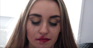
- Firstly I changed the second page from a glass of wine to a close up off the artist, looking down smiling. I thought this image allowed the audience to relate to the artist more, they are shown her emotions of happiness and joy. This make them feel more involved with the music and can figure out whether they will like it or not.
- The second thing I changed was the CD, I thought the image of make didn't have enough relevance to the artist and therefore didn't want to use it. Instead I used the sign of a old fashion bar with a brick background and added a red tone filter over the top. This related more to the artist, her music and the video my group and I created because a similar location is used in the music video and soul artists are often seen performing in these locations.
- For page 4 I kept the image the same but changed the editing. Instead of the gradient tool across the image, I put a black and white filter and the effect called 'sumi-e', I also made the red skirt its original colour. I thought this made the image look more interesting and work better with the black, white and red theme of the digipak.
- Page 5 I changed completely, I removed the initials of the artist and added a picture of spilt wine. This showed the realistic feel to of the a bum, songs and the artist. It was more relate for the audience and more intriguing. I also made the image black and white, then I made the liquid (wine) it original colour, finally i toned down the saturation by 40% so that it was less bright and a dull red/burgundy colour.
Subscribe to:
Comments (Atom)